Angelika Güc, you are an expert in visual language in marketing communication.
Why is the selection of pictures so important for the exhibition stand? Pictures are the best sellers. Because visual impressions reach us the fastest. While our brain takes pictures immediately, it first has to convert texts into information. We take 83% of all information with our eyes and 60% of the brain deals with the perception, processing and storage of images. This means that a company’s market success depends more and more on the visual representation of the brand or the product range. In addition, pictures are simply more believable than texts and stay in the memory for a lot longer.
More than any other element in marketing communication, we are captivated by images. You can do it in a split second,
- to awaken our attention
- to touch us emotionally
- to kidnap us mentally
- to put us in moods
- to tell stories
- to memorize our memory.
What tips can you give companies for using pictures at trade fairs?
At trade fairs we are confronted with a real flood of information – a mix of images, text and often also sound in combination with moving images (films, animations, virtual reality, self-running presentations, etc.). In order to reach the trade fair visitor with the abundance of offers and exhibition stands through visual communication, these five points are important:
1. Clear alignment of the visual language to the target group
The image does not have to please the marketing or sales manager, but has to appeal to the target group. It must taste good to the fish, not the angler. The prerequisite is, of course, that you know your target group or the buyer personas well. I often hear the phrase “we don’t like this” or “the image was rejected by our managing director” when selecting an image. It is not about your own taste, because it is a trade fair and not your own living room.
2. Gain emotions: Images have to touch our senses
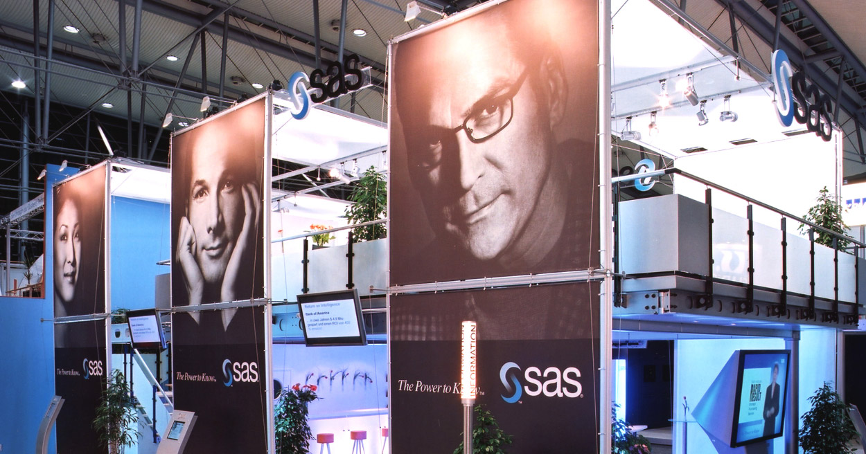
Technology companies, in particular, find it difficult to depict their services and offers visually and resort to complicated representations that appear technical and cool. Mostly, an attempt is made to stay close to the product and offer, ie to “illustrate” it. But that is not necessary at all. It is more important to address the trade fair visitor emotionally, to put him in a good mood, in a comfortable atmosphere. Only when a picture appeals to our senses do we stop and automatically record the text information. The images do not necessarily have to come from the area of the product range.

A software company at CeBIT with picture elements without any technology. The focus here is on people and users. A look straight into your eyes that you cannot avoid. (Source: eXpressive GmbH)
3. Score authentic shots
Images can be seen from a wide distance, whether they were quickly selected from an image database or whether the situation presented is realistic and credible. If this is not recognizable for the trade fair visitor, we simply do not feel that the company takes it seriously. We quickly recognize that it is an interchangeable image and our subconscious transfers this to the offer or the provider.
4. Quality has its price
High quality products and high-priced services are marketed at trade fairs. Why many companies still use junk stock photos is a mystery to me. Some budget is invested for a trade fair stand. However, the photos are often saved. In my opinion, the wrong approach, because it is the pictures that we immediately perceive at a trade fair stand. Companies have to consider whether they want to make their trade fair visits appetite for a visit to the stand with a high-quality visual language or offer visual fast food.
5. Consistent company-wide image concept
Photos and illustrations that are used at trade fairs should fit well into the cross-company visual language. The same images that are already used for brochures or the website do not necessarily have to be used. Nevertheless, recognition should be noticeable. The trade fair managers should coordinate closely with colleagues from the print, web, social media, etc.
6. Align the picture content with the stand design
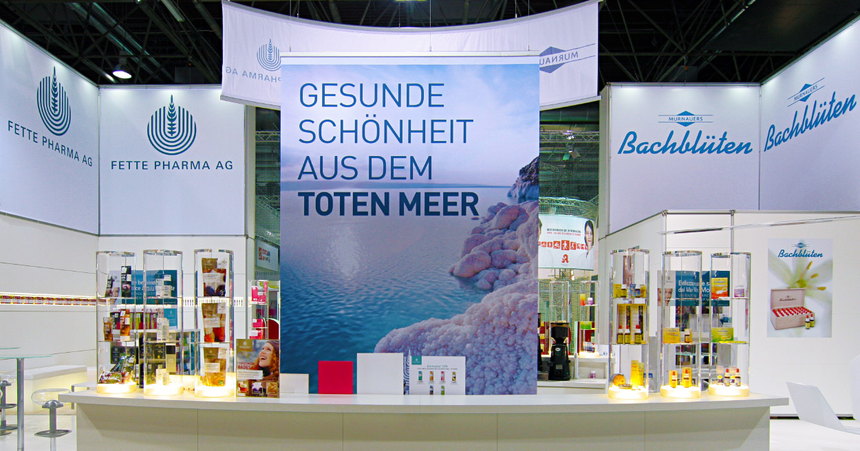
Exhibition stands are often confusing when a large number of small exhibits are exhibited. If the image banners contain any number of individual elements, this has a stressful effect on the trade fair visitor. The eye finds no rest. Texts are not effective.
Here it makes sense to form a counterpoint to the small-scale or uneasy offer with calm and uniformly colored images.

In this example, the large-format photo of the Dead Sea appears calm among the many small, colorful exhibits and also provides an ideal background for the text. (Photo: eXpressive GmbH)
7. International address through regional image concepts
Many German subsidiaries of global companies receive the exhibition graphics from the marketing department of the headquarters. The imagery does not always fit the local market and therefore does not appeal to the trade fair visitor. Here it is important to check the pictures and graphics to see whether they can reach the regional target group.

